Apple’s low-contrast UI is incredible!
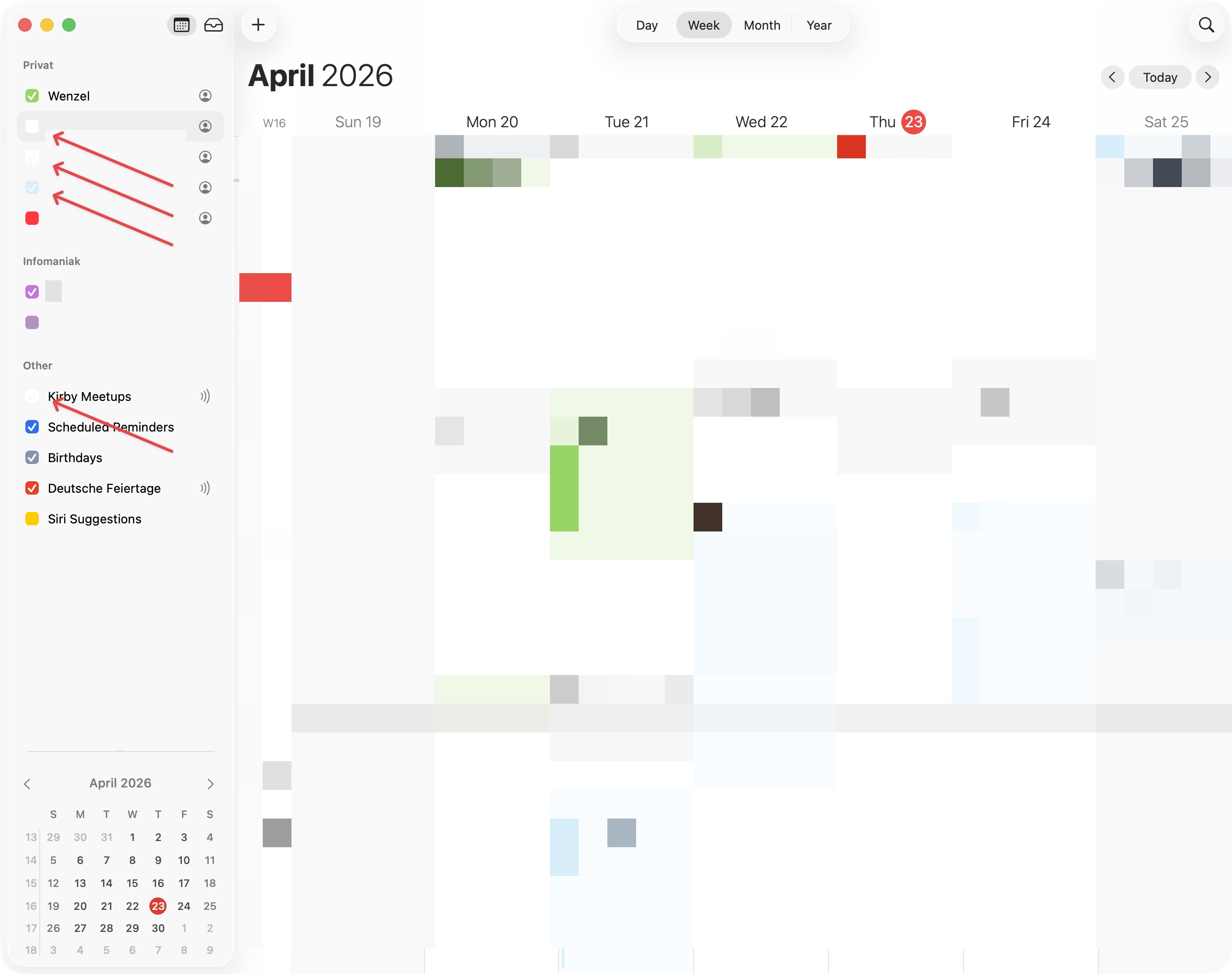
With macOS Tahoe, Apple has found new and improved ways to decrease the legibility of UI elements even further, compared to macOS Sequoia. Especially input elements such as checkmarks, selects, and text-fields have been given very effective camouflage to make using macOS a joyous “Were’s Wally”-like experience. Above a screenshot of Apple Calendar on macOS Tahoe (26.4.1), zoomed in below, featuring very light grey checkmarks, where Apple has accomplished an astonishing contrast ratio of just 1.05 to 1, sliding past all accessibility checks completely unnoticed.
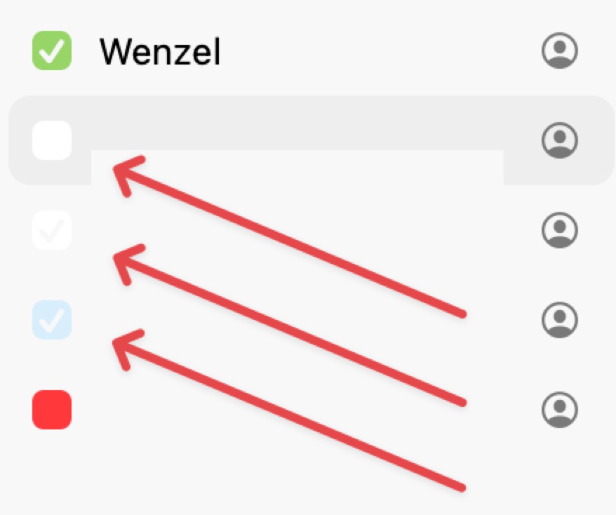
This is, of course, not the only place Apple was able to accomplish this astonishing feat. Below are some screenshots of System Settings and Feedback Assistant. These feature inputs only noticeable when applying forensics, with text legible only under ideal conditions:
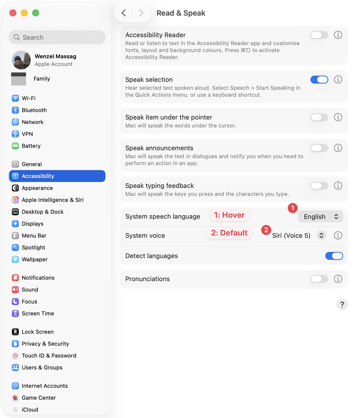
Shown above, a screenshot of the Accessibility > Read & Speak preferences in System Settings, with a select only visible due to its arrows-icon. Label “1” shows a select while hovered (pointing at it with the mouse), label “2” shows a select in its default state. These are comparatively poorly camouflaged, you can actually find them, since Apple neglected to hide the arrows-button.
An input hidden much better is the text-fields in Feedback Assistant:
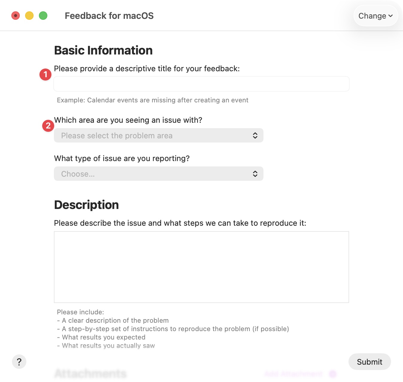
Now this is some good work! The text-field to provide a descriptive title (label “1”) blends in with its surroundings so incredibly well, it should make a chameleon blush. Incredible work! Also great, but unfortunately legible under ideal conditions and therefore camouflaged with less enthusiasm, are the placeholder-texts in the selects below (label “2”).
I suspect Apple was so focused on getting certified for use by NATO, they made camouflage a very high priority in their latest OS releases. And they did an incredible job!
In all seriousness
Looking at the UI I use daily through this lens helps me on many levels. There is no point in getting annoyed or angry every time I use an Apple device, so laughing out loud every time I run into one of those camouflaged UI-elements is my way of staying sane and calm while I wait for macOS 27 this fall.
If you’d also like to be able to see if a checkbox is checked, find text-inputs and selects, or have other suggestions how Apple might improve the UX of its products, I recommend you send them a polite note detailing your concerns, using the Apple Product Feedback form.